If Capeside Oral and Facial Surgery sounds familiar then you may recall my blog post about their branding. To refresh your memory, check it out here: trevorfulmercreative.com/blog/graphic-design-capeside
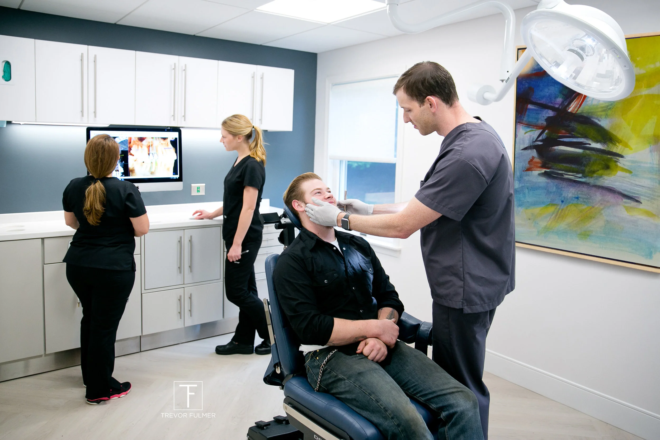
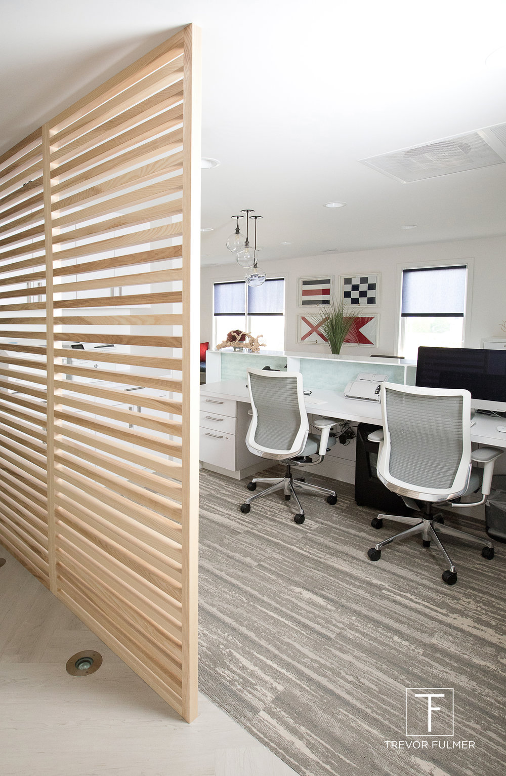
Besides identity development, I was also brought into the project as the interior designer. After months of planning, concepting and consulting, the final environment is completed and is being admired by design professionals and patients alike.
Design Rationale:
Knowing the stress that often accompanies patients prior to surgery, I wanted the nautical-inspired space to feel warm, inviting and even home-like. To create balance, I also maintained a certain level of visual cleanliness that individuals expect when visiting a surgery center. Modern art helped add a contemporary feel when paired against the nautical decor and red, white and blue color palette.
Like what you see? To learn more about my interior design services, check out: trevorfulmerdesign.com
Photography by Corinna Raznikov & Trevor Fulmer


