Photography: Kayla Harrison - Fighting Back Book

Added on by Trevor Fulmer.

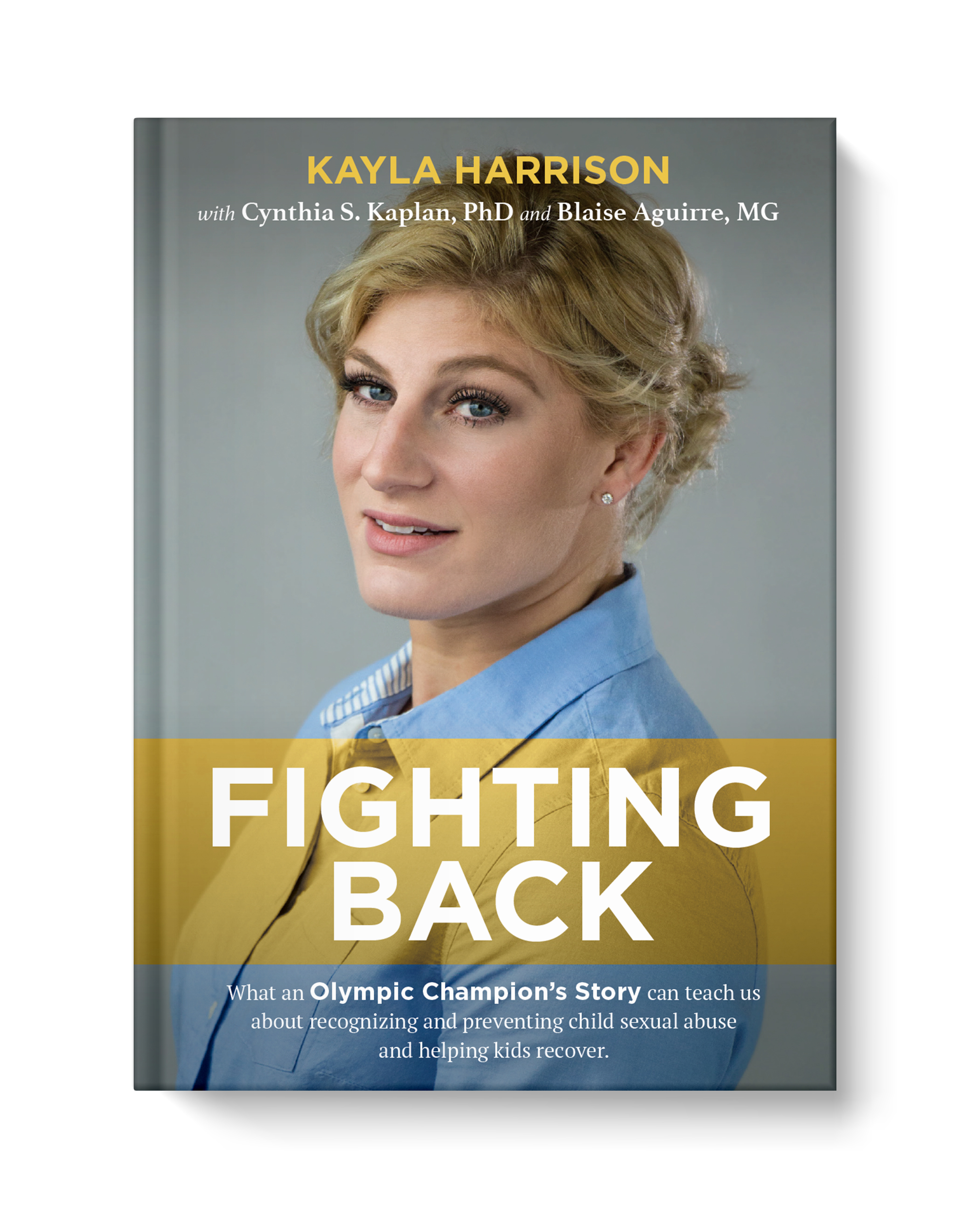
I was thrilled when Kayla Harrison, 2 time Olympic Gold Medalist in Judo and MMA Fighter, asked me to photograph her for her book cover! Kayla is incredibly strong and powerful but she is also soft and welcoming. I wanted this cover photo to convey these feelings.

As a child, Kayla was sexually abused, but now in her book titled, Fighting Back: What an Olympic Champion's Story Can Teach Us about Recognizing and Preventing Child Sexual Abuse - and Helping Kids Recover, she is tackling the issue of sexual abuse, proving that overcoming these childhood challenges is possible. To learn more about how Kayla journey, you can pick up the book here.

Kayla will make her MMA debut today, June 21 at a Professional Fighters League in Chicago. You can watch live on NBCSN or PFL Facebook. Go Kayla!!!

IMG_6986.jpg
Kayla_Fighting_Back_Book_Cover_1_Comp.jpg
IMG_7012.jpg
Kayla_Fighting_Back_Book_Cover_2_Comp.jpg
IMG_7100.jpg
IMG_7089.jpg

Behinds the scenes

IMG_6141.JPG

Big thanks to Hope Gaetani, Corey Dinopoulos & Jim Mattus for being my photo assistants.

Interior Design: Capeside Oral and Facial Surgery

Added on by Trevor Fulmer.

If Capeside Oral and Facial Surgery sounds familiar then you may recall my blog post about their branding. To refresh your memory, check it out here: trevorfulmercreative.com/blog/graphic-design-capeside

Besides identity development, I was also brought into the project as the interior designer. After months of planning, concepting and consulting, the final environment is completed and is being admired by design professionals and patients alike.

Design Rationale:
Knowing the stress that often accompanies patients prior to surgery, I wanted the nautical-inspired space to feel warm, inviting and even home-like. To create balance, I also maintained a certain level of visual cleanliness that individuals expect when visiting a surgery center. Modern art helped add a contemporary feel when paired against the nautical decor and red, white and blue color palette.

Like what you see? To learn more about my interior design services, check out: trevorfulmerdesign.com

IMG_5204_logo.jpg
IMG_5235_logo.jpg
IMG_5259_logo.jpg
IMG_5346_logo.jpg
Lobby_IMG_5229_logo.jpg
Lobby_0279_D69A6627_corinnaraznikov_New_logo.jpg
IMG_5243_logo.jpg
Consult_0304_D69A6691_corinnaraznikov_logo.jpg
IMG_5276_logo.jpg
0363_RC3A9887_corinnaraznikov_logo.jpg
Lobby_0034_D69A6887_corinnaraznikov_New_logo.jpg
Hall_0028_D69A6865_corinnaraznikov_New_logo.jpg
Hall_IMG_5277_logo.jpg
0060_D69A7069_corinnaraznikov_logo.jpg
Oper_IMG_5323_logo.jpg
Ster_IMG_5281_logo.jpg
0268_RC3A0281_corinnaraznikov_logo.jpg

Photography by Corinna Raznikov & Trevor Fulmer

Interior Design: Holiday Tablescape

Added on by Trevor Fulmer.

If you love hosting during the holidays, be sure to "wow" your friends and family with a show-stopping tablescape!

To achieve this look, I draped white pine greenery across the center of the table and allowed it to hang to the floor. I dressed the greenery with clusters of winter berries, pine cones, glass ornaments and velvet ribbon. I then set the tone of the room by filling the table with taper, pillar and tealight candles, varying the heights to take up visual space. I then added the place settings, plenty of stemware and Christmas tunes. Finally, to help the room feel even more cozy, I placed an Icelandic sheepskin rug on the chairs.

If you want to add the perfect scent to your house, have cinnamon roasted nuts in the oven! (http://trevorfulmercreative.com/blog/2015/12/1/cinnamonroastedpecans)

Merry Christmas and Happy Holidays!

IMG_7469_New.jpg
IMG_7515_New_2.jpg
IMG_7474_New.jpg
IMG_7472_Crop_New.jpg
IMG_7516_New_2.jpg

Styling and photography by Trevor Fulmer.

Interior Design: Holiday Florals

Added on by Trevor Fulmer.

It's the most wonderful time of the year...to show off your design skills!

This Christmas I've incorporated fresh florals into my home's decor. A red, green, and white color palette comes to life with red and white roses, winterberries, green mosses, white pine greenery and festive cranberries.

Designer tips:

  • Clustered your flowers into groups to give arrangements a more contemporary look.
  • Add some drama by playing with height.
  • If your vase is glass, wrap it with a large leaf or fill it with berries to hide the stems.

I hope these creations inspire you this holiday season!

IMG_7332_New.jpg
IMG_7371_New.jpg
IMG_7389_New.jpg

Floral arrangements and photography by Trevor Fulmer.

Interior Design: Cape Cod Outdoor

Added on by Trevor Fulmer.

Outdoor living is not just a trend for Southern Californian residents. Northeast dwellers, like the family who enjoys this Cape Cod home 🏡, are merging their indoor and outdoor spaces too!

For this project, I mixed wood and metal furniture with water and fade resistant Sunbrella fabrics. Accent decor like, mood-setting lanterns, hanging star candle holders and fresh greenery 🌺 helped the space feel welcoming and lush. AND what outdoor space is complete without a 8' whale tale garden sculpture?! 🐳

Learn more about my interior design and styling services at TrevorFulmerDesign.com

Styling & Photography by Trevor Fulmer

Interior Design: Airplant Decor

Added on by Trevor Fulmer.

Every spring I like to fill my home with airplant (Tillandsias) arrangements. This year, I was inspired by mixing metals and woods with the live greens. I love pairing natural elements with hard reflective metals. It creates a beautiful balance of textures. I hope these images and this blog post inspires you to create your own!

Airplant arrangements by Trevor Fulmer. Photography by Trevor Fulmer.

Graphic Design: Wedding Shower Invitation

Added on by Trevor Fulmer.

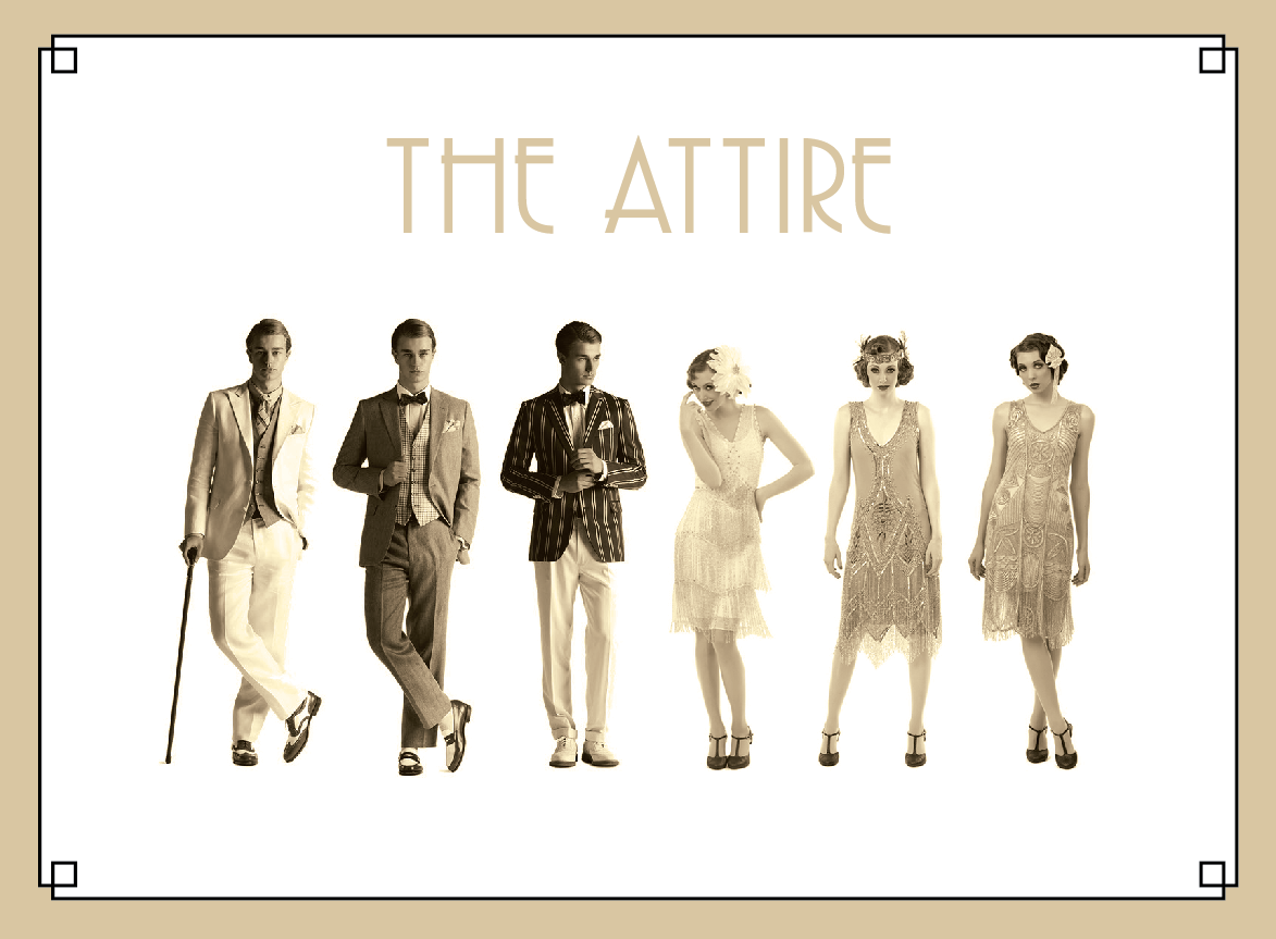
My love of Art Deco design came through in our wedding shower invitation, playfully themed - The Golden Wedding Shower.

The Great Gatsby-inspired look and feel felt celebratory, elegant, but slightly inappropriate.  Visual innuendos like splashing champagne and selective typographic hierarchy was good for a laugh.

A simple black and gold color palette made the overall invite feel refined, while simple lines and shapes added to the vintage 1920's appeal.

Interior Design: Cape Cod Residence One

Added on by Trevor Fulmer.

When designing the interior of this home, I wanted to incorporate unique textures synonymous with Cape Cod - white-washed woods, breathable airy fabrics, seagrass materials, woven twine ropes and distressed driftwood accents.

The ocean-inspired color palette balanced hues of blue and white with accents of muted yellows and delicate pinks, making this interior feel soft, romantic and welcoming.

The furniture was selected for comfort, visual variety and spacial proportions. An eggshell linen-blended couch was paired with two navy Sunbrella® fabric chairs. A dark woven seagrass coffee table anchored the room, while a white-washed pinstripe bobbin chair added an approachable elegance.

The accent decor was a marriage of old and new - collected beach treasures, handcrafted model ships, vintage tide clocks, cherished American flags, ambience-setting floor lanterns, plush throw pillows and blue and white ceramic vases.

Learn more about my interior design services at TrevorFulmerDesign.com

Photography by Trevor Fulmer

Graphic Design: Dunkin Donuts Holiday Icons

Added on by Trevor Fulmer.

Once again Dunkin Donuts is celebrating the holidays by using the festive icons I developed. You can see my creations on TV spots, packaging designs and on in-store imagery.

Design rationale: These holiday icons were a play on positive and negative space. Shapes were rotated and duplicated to create the library of icons.

Interior Design: Boston Residence One

Added on by Trevor Fulmer.

This classic Boston brownstone is a study in texture and material – from smooth leathers, natural animal prints and organic grasscloths to reflective and matte metals, thick-woven fabrics and natural woods.

The home’s decor was collected over time, melding vintage and reclaimed pieces with new and contemporary art. Distinct but unified, they tell stories of travel and family heritage.

The warm color palette was chosen to be calming and inviting. Hues of beige, brown and black established the predominately monochromatic look.

Furniture was selected for comfort and style. An oversized black leather sofa anchors the seating area, while square, camel-color ottomans provide the perfect coffee table and foot-stool combo.

To add architectural drama, a Wassily chair – designed by Marcel Breuer – was selected for its light visual weight. It also perfectly delineated the living and dining spaces, which features an expandable table perfect for both small and large parties.

While this common area had lofty 14-foot ceilings, it was restricted by a narrow footprint. To maximize space, an entertainment center was incorporated with the 12-foot fireplace while Damask-patterned drapes, an oversized mirror and gallery-style art carry slight-lines upward.

Learn more about my interior design services at TrevorFulmerDesign.com

Photography by Randy Robinson and Trevor Fulmer

JAWS-Themed Party

Added on by Trevor Fulmer.

"Get out of the water", it's time to plan the best JAWS®-themed party ever! Whether you're hosting a classy rehearsal dinner (like I did!) or planning a casual summer cocktail party, get inspired by the Great White! Just be sure to skip the shark fin soup!

Get creative with your decor! Blue hydrangeas, wooden sailboats and toy sharks create the perfect ocean-inspired centerpiece. Dune grass, driftwood, wax-dipped tweed ropes and wooden lanterns help refine the look and feel of your event. Don't forget the JAWS seating chart poster! Ours said, "Just when you thought it was safe to take your seats".

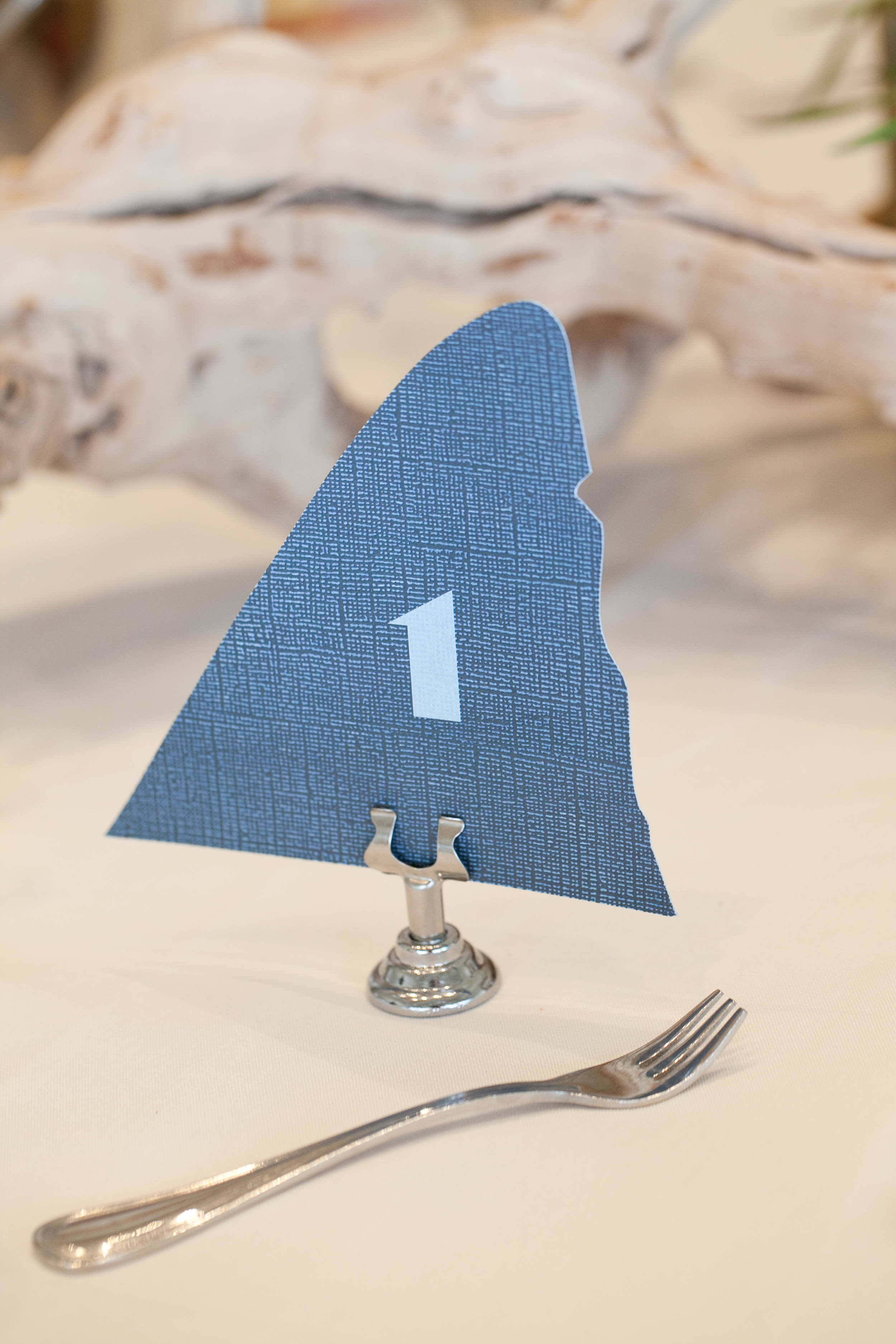
Your table settings can be just as creative! Fold your napkins in sail-inspired triangles, cut-out shark fin table numbers and place toy great white sharks at each seat.

Create playful names for signature cocktails. The "Sh-sh-shark & Stormy" is a guaranteed hit! Don't forget to garnish your drinks with gummy sharks.

Be inspired by famous JAWS® quotes and give them your own spin. The "You're gonna need a bigger plate" poster was placed at the front of our buffet line.

Nautical flag plates add one more level of detail that will make your guests "oooh" and "ahhhh".

Most importantly, surround yourself with the best shark-bait...ahem...loved ones.

Photo credit: Corinna Raznikov

Venue: Chatham Bars Inn - Boat House


Bar: Mint Julep

Added on by Trevor Fulmer.

The Kentucky Derby is two days away and, in my book, that means it's time for a Mint Julep!

If you're hosting a derby party, scroll down to learn how to craft the perfect cocktail and educate yourself with some mint julep trivia like, how many juleps are served at Churchill Downs during the 2-day event.

Photography, food styling, prop styling and graphic design by Trevor Fulmer.

Bar: Rosemary Sazerac Cocktail

Added on by Trevor Fulmer.

Today's craft cocktail series showcases the official cocktail of New Orleans - the Sazerac. And if you have been following my posts, you may see I have included a familiar herb - Rosemary.

Scroll down to check out the easy-to-read infographic recipe, salivating photography and a "did you know" history.

Enjoy and let me know your favorite drink. It could be my next "Bar" post!

Photography, food styling, prop styling and graphic design by Trevor Fulmer.

Graphic Design: Wedding Invitation

Added on by Trevor Fulmer.

To celebrate the one year wedding anniversary of my good friends Stephen and Travis, I am featuring their wedding invitation collection. Happy anniversary gents!

Stephen and Travis celebrated their marriage with family and friends in Palm Springs, CA at the Frank Sinatra House. This incredibly unique location inspired me to establish a look and feel reminiscent of the mid-century modern era.

Design Rationale: The silhouetted grooms, illustrated Frank Sinatra home and Mid-century modern typography echoed the styles and trends of a 1950's Palm Springs. An orange-hued color palette was used on layouts that represented evening events while a light blue color was introduced for morning and afternoon gatherings. Enjoy!

Bar: French 75 Cocktail

Added on by Trevor Fulmer.

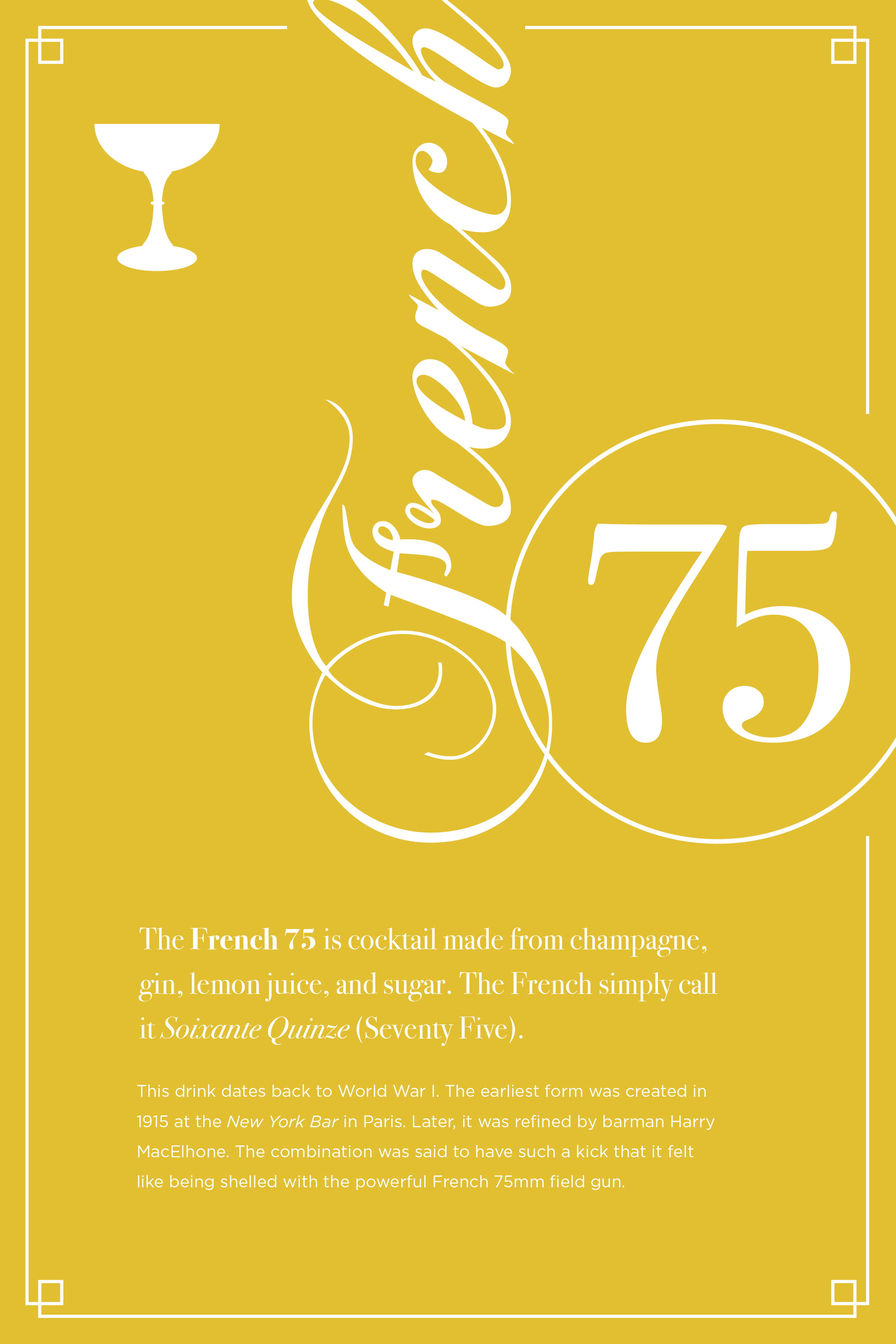
So begins my craft cocktail series. For each "Bar" post, I will be featuring easy-to-read infographic recipes, enticing photography and a brief "did you know" history of each cocktail.

First up, the French 75. It's delicious and super simple - only 4 ingredients. If you're hosting, impress your guests with this classy cocktail.
Scroll down to enjoy and let me know your favorite drink. It could be my next "Bar" post!

Photography, food styling, prop styling and graphic design by Trevor Fulmer.

Photography: Tiffany Twist Knot Earrings

Added on by Trevor Fulmer.

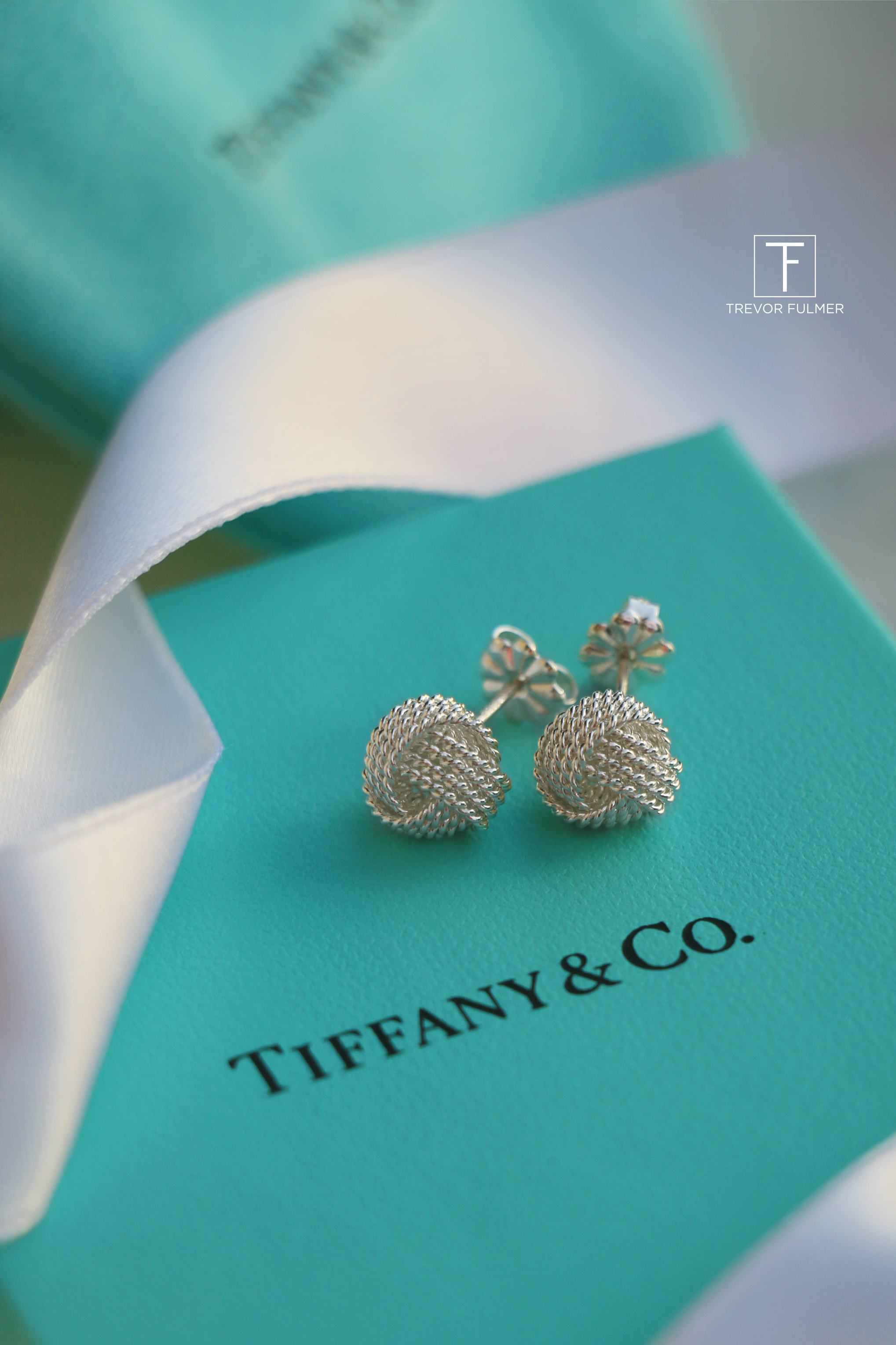
The sight of Tiffany & Co.'s turquoise box is everything. The box alone elicits excitement and anticipation for the elegance inside. Knowing this, I decided to photograph the Twist Knot Earrings and style the set with elegant Tiffany-inspired colors and materials.

This set features white carrara marble, a turquoise box, rope drawstring velvet bag and white satin ribbon. The marble surface is inspired by Tiffany & Co's retail space. The box, at this macro level, provides a unique pebbled texture. The velvet bag, which typically houses the jewelry, adds softness and creates contrast against the cold sterling silver. The white satin ribbon creates a feminine tone, emphasizes depth and breaks up the turquoise color field. The slightly overhead angle and shallow depth of field help the eye focus on the intricate twisted silver knot.

For more info on these show-stoppers, check out tiffany.com

Photography and prop styling by Trevor Fulmer.

Graphic Design: Dunkin' Donuts Espresso Program

Added on by Trevor Fulmer.

For #TBT I am featuring my creative work for Dunkin' Donut's Espresso Education Program and Macchiato Launch. This campaign was developed to educate consumers on Dunkin's espresso beverage line-up.

Simple icons were created to inform patrons of 1) the type of ingredients and 2) the order of ingredients that are in each espresso beverage. On some creative executions, the icons were replaced with photographs, which helped visually depict the layers and emphasize appetite appeal.

The brown to beige color spectrum represented the beverages with no milk (darkest browns) to the beverages with mostly milk (light browns).

Besides developing the educational program look and feel, I was also responsible for art directing the photo shoot which featured the cappuccino, latte and new macchiato. The set was filled with dark rich tones and natural directional light that felt premium and authentic.

Photography by Jim Scherer. Set design by Verne Cordova. Food styling by Karen Tully and Kendra Smith. Art Direction by Trevor Fulmer.